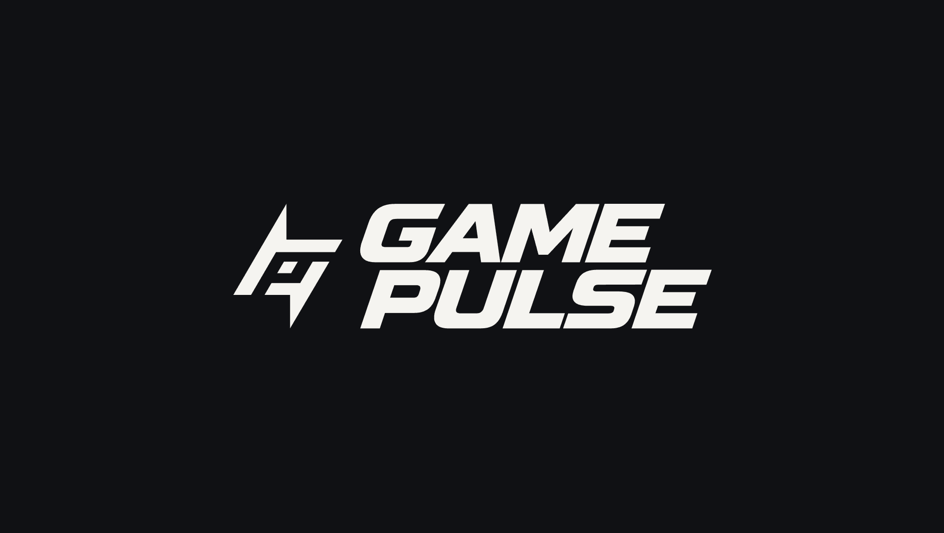
A bold visual identity for Game Pulse, a sports media and athlete development company. Built around a custom lightning-inspired monogram, dynamic typography and an energetic color system, the brand captures the movement, competition and excitement of sports.
Client
Game Pulse
Role
Brand Identity & Creative Direction
Scope
Brand Strategy, Logo Design, Typography, Visual Identity, Brand Applications
An identity built for the energy of sports
Game Pulse is a modern sports media and athlete development company operating across photography, videography, live streaming, youth soccer training and collegiate recruiting.
With services spanning multiple areas of the sports industry, the brand needed an identity that could bring everything together without losing the energy and personality that make sports compelling.
We developed a bold visual system built around movement, competition and instant recognition. From its custom lightning-inspired monogram to its expressive typography and high-energy color palette, every element was designed to capture the feeling of being part of the game.
The challenge
One identity for every side of the game.
Game Pulse operates at the intersection of sports media, athlete development and recruiting. Its identity needed to feel equally relevant on the sidelines, across digital platforms and in environments dedicated to helping athletes develop.
The challenge was bringing these different services together under one recognizable brand without creating an identity that felt generic or overly complicated.
We wanted something that felt unmistakably connected to sports while remaining distinctive enough to stand independently of any particular team, league or sport.
Our approach
Movement, energy and recognition.
We approached the identity with a focus on strong geometry, expressive typography and a visual language inspired by the pace of competition.
Rather than relying on familiar sports imagery, we developed a custom symbol that combines the initials GP with the sharp, directional form of a lightning bolt.
The resulting identity establishes an immediate connection to the Game Pulse name while creating a flexible visual foundation for digital, print and environmental applications.
The symbol
A mark designed to move.
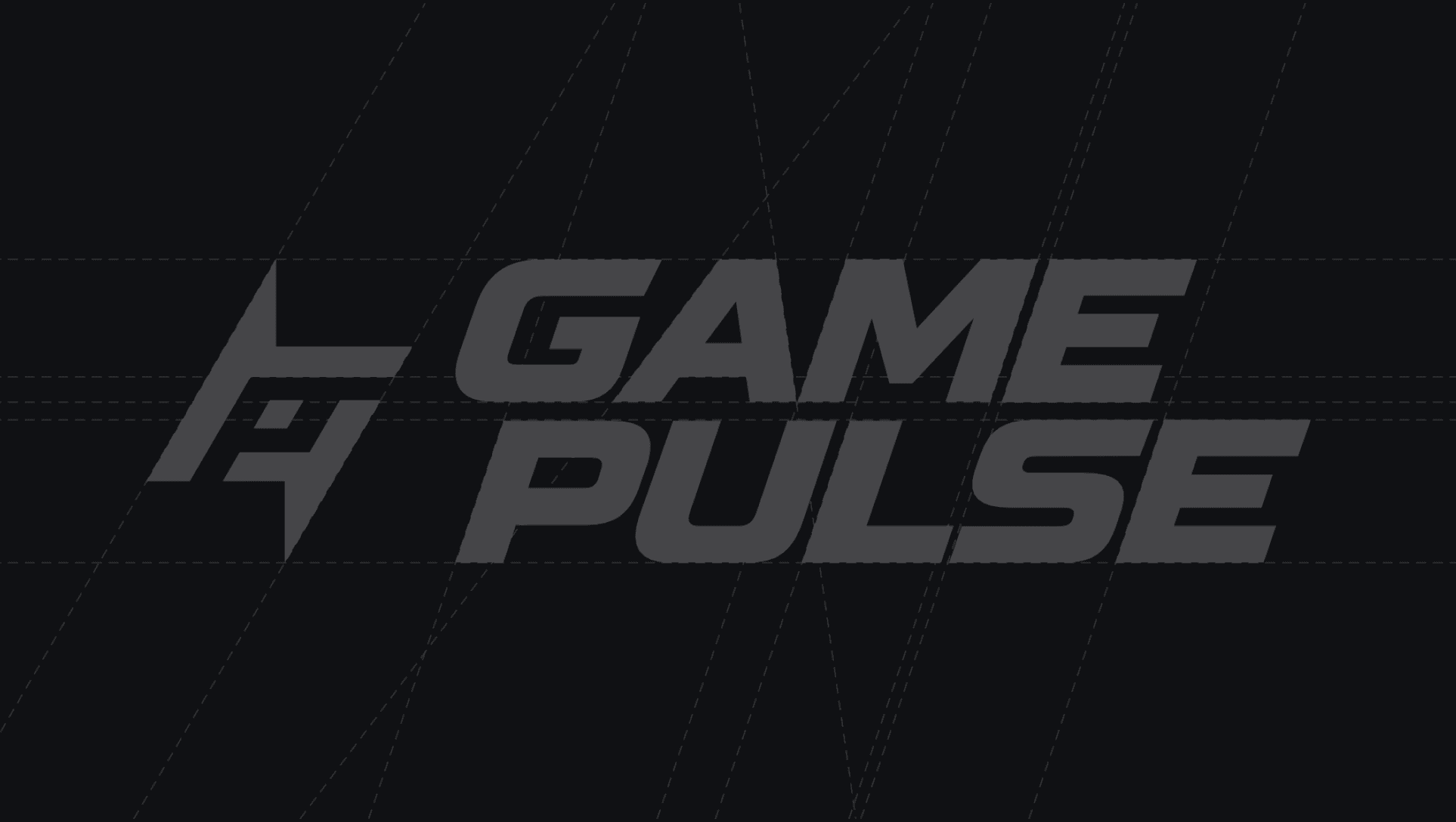
The Game Pulse monogram brings together the letters G and P in a compact, angular symbol inspired by movement and electricity.
Its lightning-inspired silhouette reinforces the energy behind the brand, while its geometric construction gives it the clarity needed to remain recognizable across different applications.
We refined the symbol's proportions, angles and negative space to create a mark that works independently of the wordmark.
The result is a distinctive visual signature that can move between social media avatars, video graphics, apparel and larger brand applications.
The visual identity
Bold by design. Built for competition.
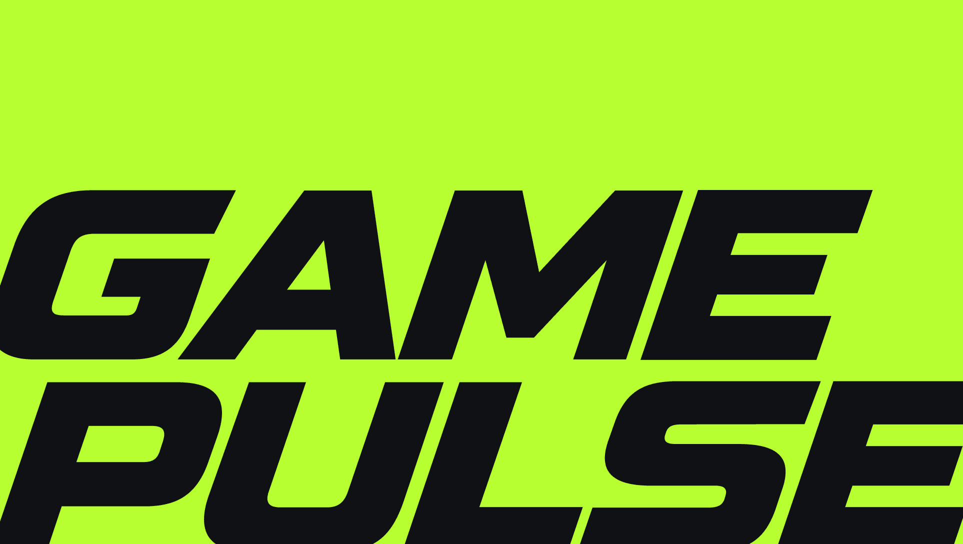
The visual system pairs custom, athletic-inspired typography with a vibrant color palette and high-contrast compositions.
The wordmark features wide, angular letterforms with a forward-leaning stance that reinforces the brand's sense of movement.
Electric lime, vivid red and bright blue introduce flexibility across applications, while near-black provides a consistent foundation.
Together, these elements create a visual identity that feels energetic without relying on unnecessary decoration.
Built for the digital sidelines
A recognizable presence wherever the game happens.
For a sports media company, its identity needs to perform in fast-moving digital environments where recognition happens in seconds.
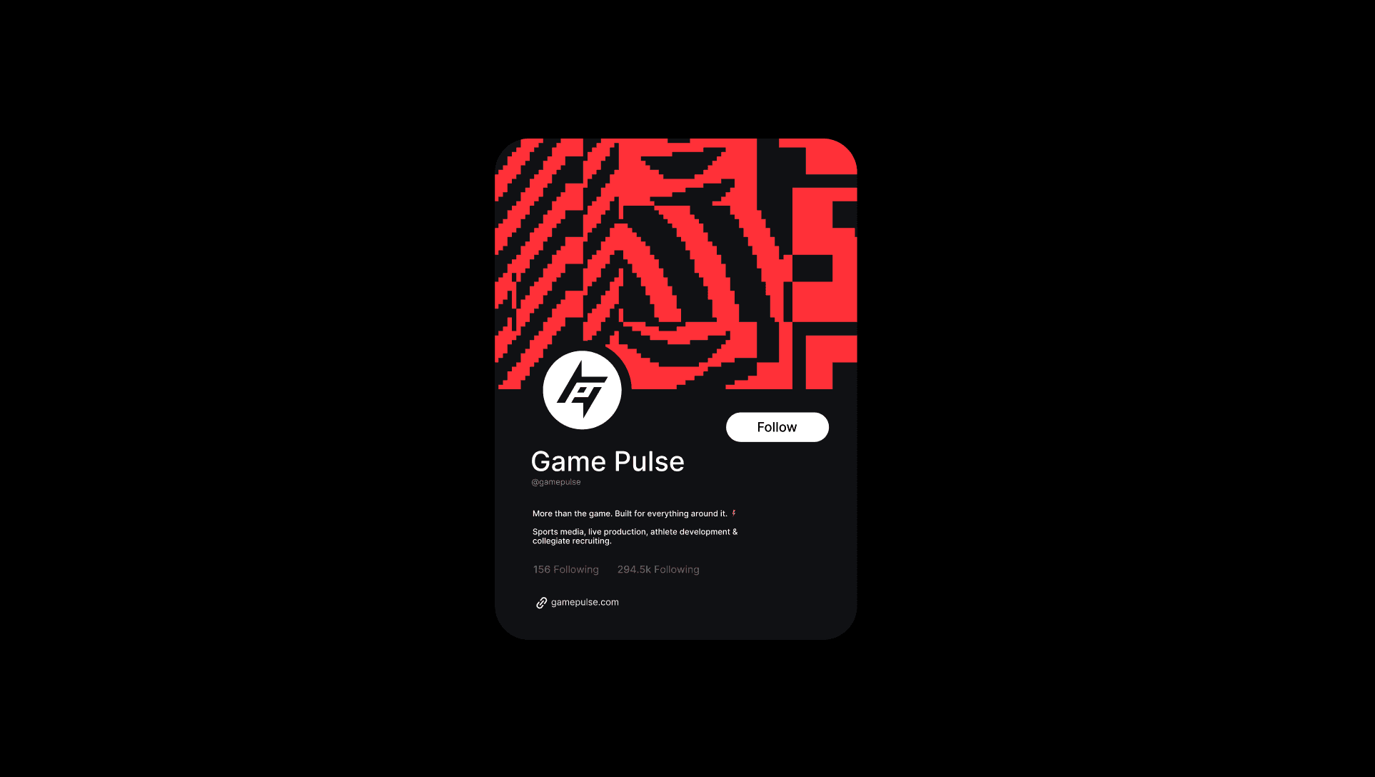
We explored how the Game Pulse identity could translate into social media profiles, digital graphics and branded content.
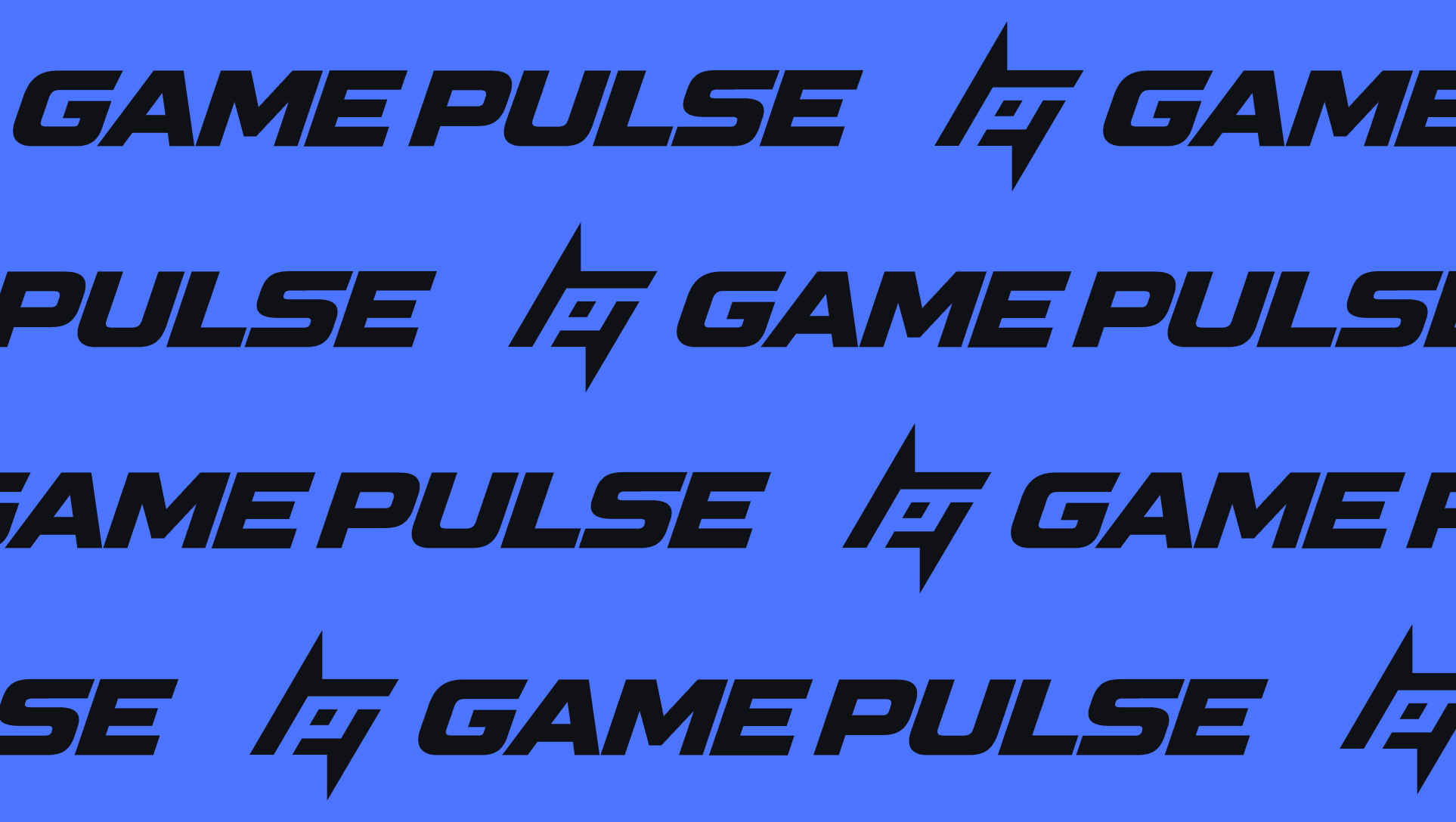
The compact monogram creates a recognizable avatar, while the expressive color palette and typography allow the broader identity to adapt to different content formats.
We also developed supporting graphic treatments that introduce texture and movement while keeping the core identity consistent.
A flexible system
More than a logo. Built for everything around it.
The Game Pulse identity was designed to accommodate a company whose work extends beyond sports media.
The combination of a recognizable monogram, distinctive wordmark, bold colors and repeatable graphic elements allows the brand to move across its different services while maintaining a consistent visual presence.
Whether it's used in photography, video production, live streaming or athlete development, the identity provides a unified foundation without limiting how the brand can evolve.
The outcome
One identity. Every moment of the game.
The result is a bold, adaptable identity that brings the different sides of Game Pulse together under one recognizable brand.
The custom monogram establishes an unmistakable visual signature, while the typography, color system and supporting graphics give the company the flexibility to communicate across multiple platforms.
For Vaughn, the project demonstrates how a focused visual idea can become a complete identity, creating consistency without compromising personality.
An identity designed to move with the brand, wherever the game takes it next.