A brand identity for Bright Logistics, a veteran- and woman-owned transportation company. Built around clarity, discipline and consistency, the identity combines a distinctive geometric symbol, contemporary typography and a flexible visual system designed to work across digital, environmental and real-world applications.

Client
Bright Logistics
Role
Brand Identity & Creative Direction
Scope
Brand Strategy, Visual Identity, Logo Design, Brand Applications
A clearer direction for logistics
Bright Logistics is a veteran- and woman-owned transportation company built on precision, discipline and trust. With a commitment to reliable service and lasting partnerships, the company needed an identity that reflected the way it operates.
We developed a visual identity around one central idea: confidence doesn't need to be complicated.
Rather than relying on the visual conventions of the transportation industry, we focused on restraint. Simple geometry, purposeful typography and an expressive yet controlled color palette establish a brand that feels both approachable and dependable.
The result is a recognizable identity designed to move seamlessly between digital platforms, physical environments and everyday operations.

The challenge
Standing apart without adding to the noise.
The logistics industry is built on moving complex things efficiently, yet its visual landscape is often filled with unnecessary complexity. Traditional transportation symbols, aggressive typography and familiar corporate identities make differentiation difficult.
Bright needed an identity that communicated the company's values without falling into those conventions.
As a veteran- and woman-owned business, Bright brings a perspective shaped by discipline, integrity and a commitment to serving others. Its vision extends beyond transportation to supporting community development, veteran-owned businesses and minority-owned enterprises.
Our challenge was to translate these principles into a visual system that felt confident, contemporary and distinctive while remaining practical enough for everyday use.
Our approach
Clarity over excess. Purpose in every detail.
We approached the project with the same principles that define Bright's operations: precision, consistency and attention to detail.
The name itself provided a natural starting point. Bright suggests clarity, optimism and forward movement, qualities that align with the company's commitment to making transportation more dependable and accessible.
We wanted to build on those associations without creating an identity that felt overly literal.
Our direction centered on a minimal geometric symbol, carefully considered typography and a flexible visual language that could adapt to the company's growing needs.
Every design decision was guided by a simple question: does this make the brand clearer, stronger or more recognizable?
The symbol
A single point. Multiple directions.
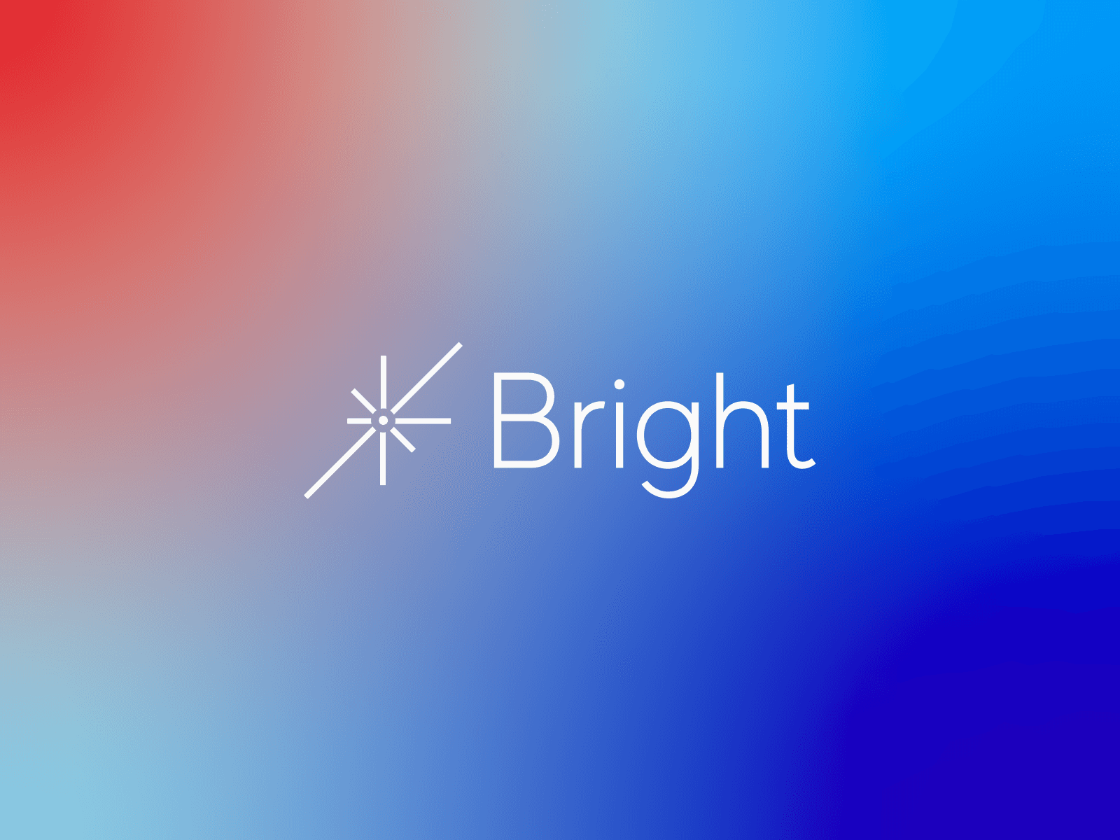
At the center of the identity is a custom geometric symbol constructed from a series of lines radiating outward from a central point.
Its form brings together several ideas fundamental to the Bright brand: connection, movement, direction and possibility.
The radiating lines suggest the interconnected nature of transportation, where multiple routes, people and destinations come together through one coordinated system. At the same time, the mark subtly references light, creating a direct visual connection to the company's name.
We intentionally avoided unnecessary detail. The resulting symbol is simple enough to work at small sizes, distinctive enough to stand independently and flexible enough to extend across a wide range of applications.
It gives Bright a recognizable visual signature without relying on an obvious transportation icon.

The visual identity
Quiet confidence, made recognizable.
The visual system was designed to reflect operational discipline while introducing a more approachable personality to the logistics industry.
A rich blue establishes the brand's foundation, communicating stability, professionalism and trust. Supporting gradients introduce warmth and optimism, creating a subtle contrast between the structured identity and its more expressive applications.
Contemporary typography reinforces the system's simplicity. Clean letterforms and carefully balanced proportions allow the wordmark to complement the symbol without competing for attention.
Together, these elements create a consistent visual language that can be understated when necessary and more expressive when the application calls for it.
The goal was never to make every touchpoint look identical. It was to establish enough consistency that each application could feel unmistakably Bright.
Designed for the real world
An identity built to go wherever the work happens.
Logistics doesn't happen in one place. Bright's identity needed to perform across the diverse environments where the company operates, from digital communications to transportation equipment and field applications.
We designed the system to remain recognizable regardless of its size, medium or environment.
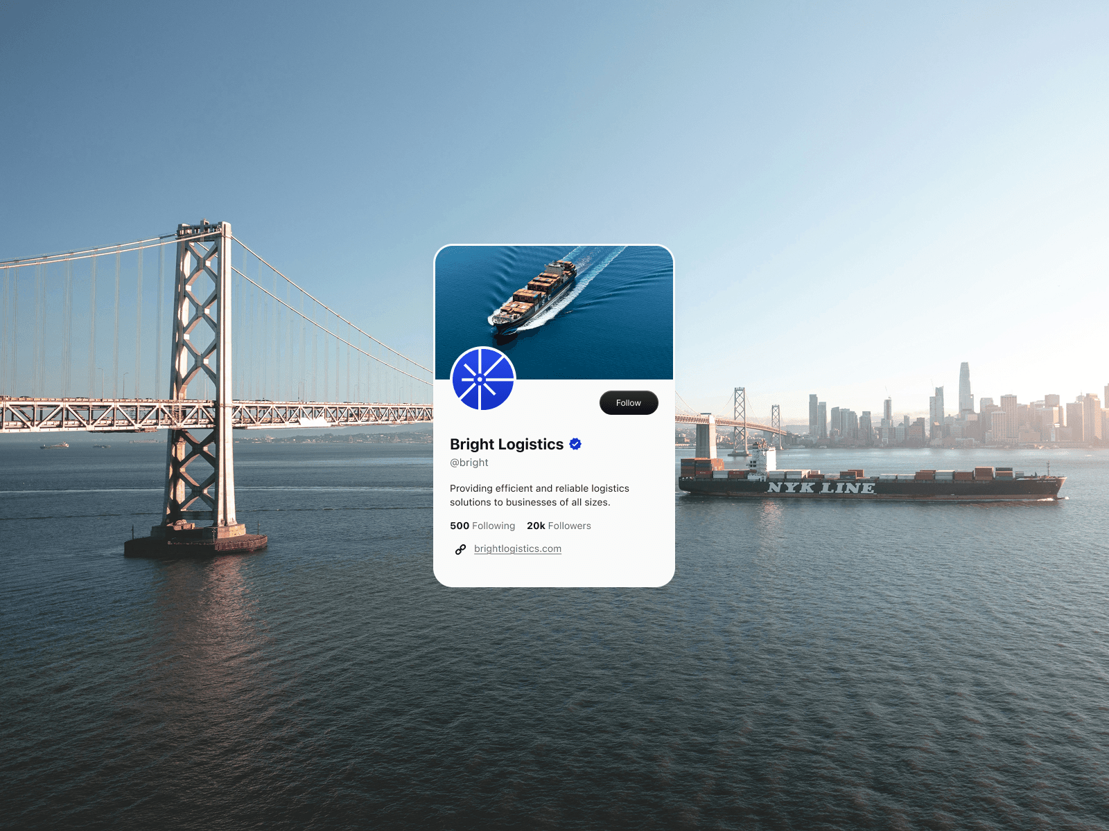
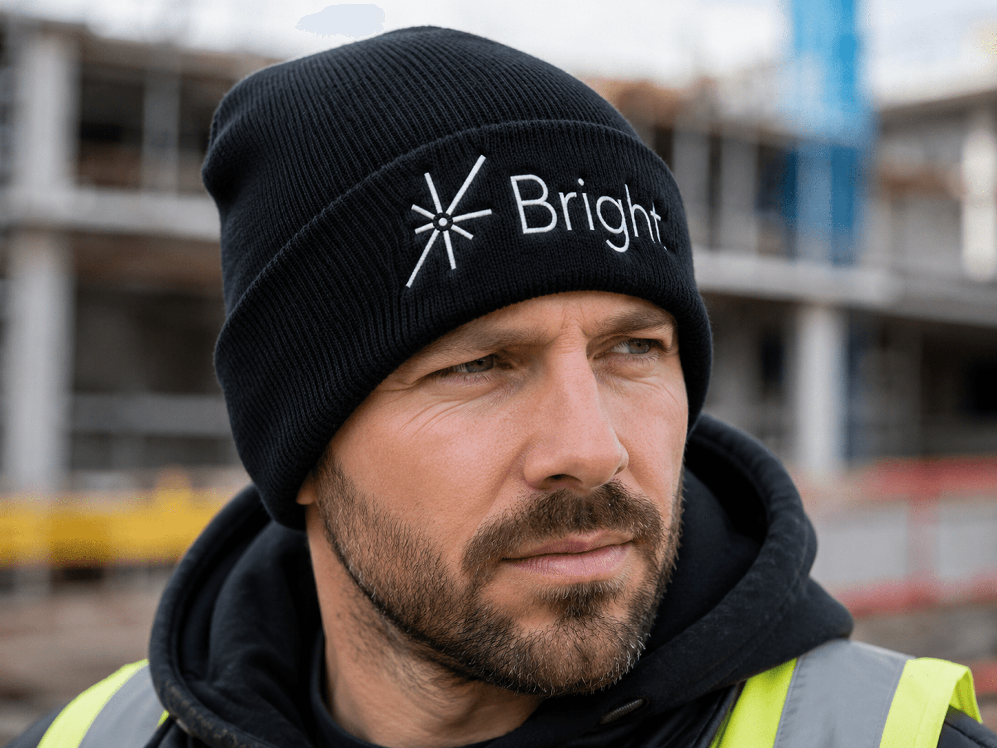
The symbol can function independently as a digital avatar, an embroidered mark on company apparel or a prominent graphic in larger brand applications.
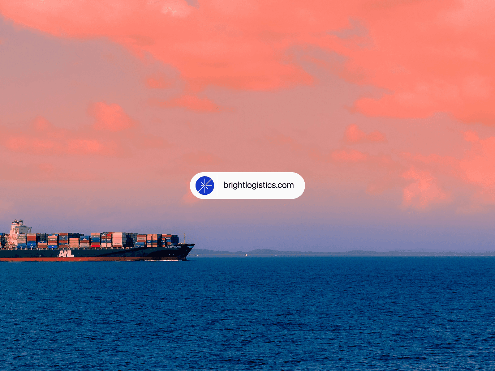
The wordmark provides a clear, consistent signature, while the broader visual system creates opportunities to incorporate photography, gradients and supporting graphic elements without compromising recognition.
This flexibility gives Bright a foundation that can grow alongside the business while remaining consistent across its many touch-points.
Every morning deserves a Bright start
Connecting the brand to a bigger idea.
One of the defining opportunities within this project was the name itself.
Bright represents more than a logistics company. It creates an opportunity to communicate optimism, reliability and the confidence that comes from knowing the work will be done right.
We explored that connection through the message, "Every morning deserves a Bright start."
The line reinforces the company's commitment to dependable service while introducing warmth and personality into an otherwise operational industry.
Paired with natural lighting, expansive landscapes and transportation photography, it establishes a visual narrative built around forward movement and new possibilities.
The geometric symbol becomes an extension of that idea, subtly referencing the first light of day while retaining its meaning as a network of interconnected routes.
Built to scale
Consistency across every application.
A strong identity should make it easier for a company to grow without repeatedly reinventing how it presents itself.
For Bright, we established a system of recognizable elements that can be combined, adapted and expanded as the company develops.
The simplicity of the mark allows it to translate into both physical and digital applications. The typography establishes a consistent voice, while the color system provides the flexibility to move between understated corporate communications and more expressive brand moments.
Each element was designed to work independently while remaining part of a cohesive identity.
Whether the company is introducing itself to a new customer, communicating with an existing partner or entering a new market, its visual identity provides a consistent foundation.

The outcome
A distinct identity grounded in what matters.
The result is a visual identity that reflects Bright Logistics' commitment to precision, reliability and the people it serves.
Built around a distinctive geometric symbol, restrained typography and a flexible color system, the identity introduces a contemporary perspective to the logistics industry without losing the professionalism its customers expect.
Its simplicity makes it recognizable. Its flexibility makes it practical. And its connection to the company's purpose gives it meaning beyond its visual appearance.
For Vaughn, Bright represents the kind of identity work we believe in: thoughtful design that removes unnecessary complexity, communicates what makes an organization different and creates a foundation for what comes next.
Good design isn't about adding more. It's about making what matters unmistakable.
(Full-width closing image featuring the Bright Logistics logo, branded apparel, transportation photography and identity applications.)

